


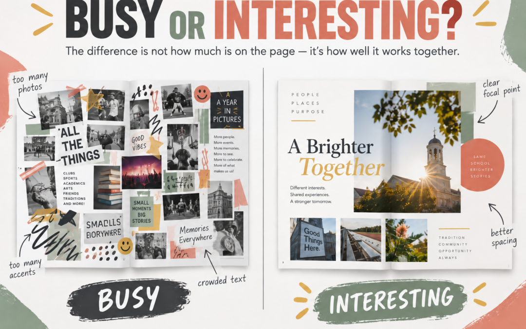
Some yearbook pages grab your attention in a good way.
Others grab your attention because there is just too much happening.
That is the difference between a page that feels interesting and a page that feels busy.
Both may have a lot going on. Both may include several photos, colors, captions, and design elements. But one feels exciting and easy to explore, while the other feels crowded and harder to read.
The goal is not to make every page simple. The goal is to make sure every part of the page has a purpose.
1. Interesting Pages Have a Clear Focus
An interesting page gives the reader a clear place to start.
That might be:
- One larger photo
- A strong headline
- A bold quote
- A main story element
A busy page often tries to make everything stand out at once.
If every photo is competing for attention, every graphic is bold, and every section is demanding a look, the reader may not know where to begin.
A clear focal point makes the rest of the page easier to understand.
It tells the reader:
Start here, then keep exploring.
2. Interesting Pages Add Variety Without Repetition
A page becomes more interesting when different elements do different jobs.
For example:
- One photo shows the full scene
- Another shows a reaction
- Another captures a detail
- A quote adds personality
- A caption adds context
A busy page often repeats the same type of content over and over.
That might look like:
- Several photos of the same moment
- Too many graphics doing the same thing
- Repeated text blocks
- Decorative elements that do not add information
Variety gives the page energy.
Repetition without purpose gives it clutter.
3. Interesting Pages Leave Room to Breathe
A page does not have to be empty to feel balanced.
But it does need enough space for the content to be readable and noticeable.
When every inch is filled, even strong content can feel weaker.
Photos lose impact.
Captions feel squeezed.
Important details disappear.
A little breathing room helps readers move through the page naturally. It also makes the strongest parts of the page stand out more.
Sometimes the difference between busy and interesting is not adding something new.
It is removing something that is not helping.
Final Thought
A busy page is not always a bad page.
Sometimes it just needs clearer priorities.
A more interesting page does not necessarily have less content. It simply has better direction.
Start with one clear focal point.
Use variety with intention.
Leave enough space for the page to breathe.
When each element has a job, the page feels easier to read, more enjoyable to explore, and much more memorable.
Create Pages That Catch Attention for the Right Reasons
YearbookLife gives schools flexible creation options, easy-to-use software, expert support, and high-quality printing to help yearbook teams create pages that feel clear, engaging, and well designed.
Ready to start creating your school’s yearbook? Request your free, no-obligation quote today at YearbookLife.com.
Click HERE
