


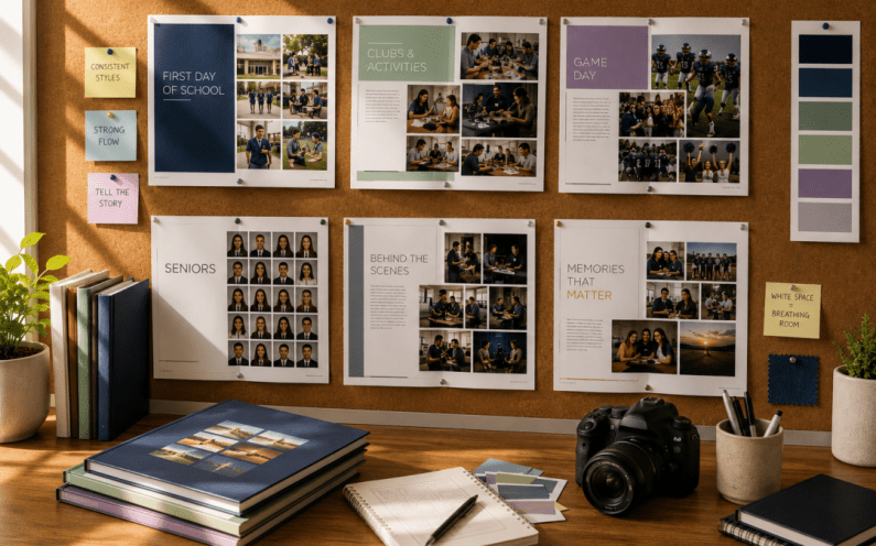
Some yearbooks immediately feel polished the moment you open them.
You may not know exactly why, but everything seems to fit together. Turning the pages feels effortless. Photos are easy to follow, colors work together naturally, and each spread feels connected to the next.
Then there are yearbooks that have great photos and fun memories but somehow feel a little chaotic. Nothing is technically “wrong,” yet readers may find themselves working harder to follow each page.
The difference usually isn’t one big design choice—it’s dozens of small decisions working together behind the scenes.
Just like a well-designed home, museum, or magazine, a great yearbook quietly guides the reader from page to page without them ever thinking about it. That’s the sign of thoughtful planning.
Here are five subtle design principles that help create a yearbook that feels organized from cover to cover.
1. Consistency Builds Confidence
One of the easiest ways to make a yearbook feel professional is by creating consistency.
Readers naturally become comfortable when they recognize familiar design elements throughout the book. That doesn’t mean every page should look identical, but recurring details create a sense of structure.
Consider keeping elements such as:
- Similar headline styles
- Consistent font pairings
- Repeating photo treatments
- Matching spacing around photos
- Standard caption placement
These small choices help readers focus on the content instead of figuring out how each page works.
A consistent design creates a smoother reading experience from beginning to end.
2. Good Page Flow Feels Natural
Think about how someone experiences your yearbook.
Rarely does a reader stop after one spread. Most continue flipping through page after page, so the transition between spreads matters more than many people realize.
Ask yourself:
- Do colors transition smoothly?
- Does one section naturally lead into the next?
- Are similar events grouped together?
- Does each spread feel connected to the overall story?
Good page flow doesn’t call attention to itself—it simply makes the book enjoyable to explore.
3. Visual Rhythm Keeps Readers Engaged
Music isn’t interesting if every note has the same volume.
Yearbook design works much the same way.
If every page contains twenty photos, multiple graphics, bright colors, and large headlines, readers can quickly become overwhelmed. On the other hand, if every spread is minimal, the book may begin to feel repetitive.
A great yearbook alternates its visual energy.
Some spreads are filled with excitement, action shots, and bold graphics. Others slow the pace with larger photos, generous white space, and cleaner layouts.
This natural rhythm gives readers moments to absorb what they’re seeing before moving on to the next story.
4. Color Should Connect the Book, Not Compete With It
Color is one of the most powerful tools in yearbook design, but it works best when used with intention.
Many successful yearbooks choose a limited color palette that appears throughout the book in subtle ways. Accent colors, section dividers, backgrounds, and graphic elements all work together to create a cohesive look.
That doesn’t mean every page has to match exactly.
Instead, think of color as the thread that ties the entire book together.
When colors complement one another from beginning to end, the yearbook feels unified, even if readers never consciously notice why.
5. Every Page Doesn’t Need to Do Everything
One of the biggest design temptations is trying to fit every great photo, quote, and detail onto a single spread.
But thoughtful editing is part of great design.
Giving photos room to breathe, allowing headlines to stand out, and leaving intentional open space helps readers focus on what matters most.
Sometimes what you choose not to include has just as much impact as what you do.
A cleaner layout often tells the story more effectively than a crowded one.
The goal isn’t to fill every inch of the page, it’s to guide the reader’s attention to the moments that deserve it most.
Final Thought
The best yearbook design often goes unnoticed and that’s exactly the point.
When spacing feels balanced, colors work together, pages transition naturally, and layouts maintain a consistent rhythm, readers aren’t thinking about design. They’re simply enjoying the stories unfolding in front of them.
Those invisible decisions are what transform a collection of photos into a polished publication that feels intentional from the first page to the last. Great design doesn’t demand attention—it quietly supports every memory the yearbook is there to tell.
Ready to Create a Yearbook That Looks as Good as It Feels?
Whether you’re designing your first yearbook or looking for a smoother publishing experience, YearbookLife is here to help. From flexible creation options to friendly support and high-quality printing, we make it easier to bring your vision to life.
Request your free, no-obligation quote today at YearbookLife.com and see how simple creating an exceptional yearbook can be.
Click HERE
