


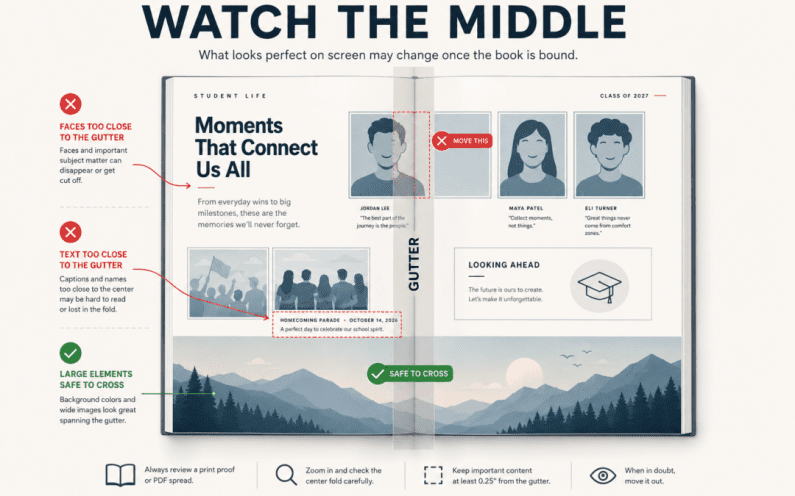
A yearbook spread can look perfect on a computer screen.
The photos line up. The headline stretches across both pages. Everything feels balanced.
Then the book is printed, bound, and opened and suddenly part of that beautiful design feels a little harder to see.
The reason is the gutter.
The gutter is the center area where two facing pages meet at the binding. It may seem like a small detail during design, but it can affect how photos, text, faces, and other important content look once the yearbook becomes a physical book.
Understanding how to design around it can help your spreads look just as strong in print as they do on screen.
1. The Screen Is Not the Finished Book
When you design a spread digitally, the two pages usually appear completely flat next to each other.
A printed yearbook works differently.
The pages curve slightly toward the center where they are bound together. Depending on the book and binding, some of the content closest to that center may become harder to see.
That does not mean you should avoid using the center of the spread altogether. It simply means you should think about what you place there.
Large background colors, textures, patterns, and other decorative elements can usually move across the gutter without creating a problem.
Important information deserves more protection.
Try to keep things like these away from the exact center:
- Faces
- Student names
- Small text
- Captions
- Important parts of a photo
- Logos
- Dates
- Scores
- Detailed graphics
A design can cross the gutter while still keeping the most important content safely visible.
2. Be Careful With Photos That Cross the Center
Large photos stretched across two pages can look dramatic, and they can work very well.
The key is choosing the right photo.
Imagine a team photo with one student standing directly in the center of the image. If that face lands in the gutter, part of the student may disappear into the binding.
The same problem can happen with a close-up portrait, a group of friends, or even an important object.
Before placing a photo across the center, look at what falls directly on the page break.
Ask:
If the middle portion became harder to see, would the photo still work?
If the answer is no, adjust the image.
You may be able to:
- Move the photo slightly left or right
- Crop it differently
- Choose another image
- Place the photo on only one page
- Use the center for background space instead
Sometimes a small adjustment is all it takes to protect the most important part of the image.
3. Review the Spread Like a Printed Book
One of the easiest ways to catch gutter problems is to stop looking at the spread only as one large digital canvas.
Look at it as two individual pages that will eventually meet in the middle.
Check the center carefully before calling the spread finished.
Look for:
- Faces sitting directly on the page break
- Headlines with important letters crossing the center
- Captions too close to the gutter
- Names or page information that may become difficult to read
- Photos where the main subject disappears into the center
- Important details that depend on both pages appearing completely flat
You should also make sure each side of the spread still feels balanced.
A spread can connect visually from left to right without requiring the reader to flatten the book completely just to understand it.
That is the goal.
Final Thought
The gutter is easy to overlook because it is barely noticeable while you are designing on a screen.
But yearbooks are not ultimately viewed as flat digital spreads. They are printed, bound, opened, passed around, and read as physical books.
A little extra attention to the center of each spread can protect important photos and information while still allowing you to create bold, connected layouts.
Before approving your next spread, take one extra look at the middle.
Ask yourself:
What would happen to this design if part of the center became harder to see?
That simple check can prevent one of the easiest yearbook layout problems to miss.
Build With the Finished Book in Mind
YearbookLife gives your team the tools and support to move from early page planning to a professionally printed yearbook. With flexible creation options, easy-to-use software, expert support, and high-quality printing, you can design with confidence from the first spread to the final book.
Ready to start creating your school’s yearbook? Request your free, no-obligation quote today at YearbookLife.com.
Click HERE
