


You’re down to the wire. Pages are (mostly) done. Deadlines are looming. And suddenly… every little detail starts jumping out at you.
The good news? You don’t need a full redesign. A few smart, last-minute tweaks can take your pages from “good enough” to polished and professional.
Here are three fixes that deliver the biggest impact—fast.
Fix #1: Clean Up Your Alignment & Spacing
If something feels slightly off on your page but you can’t quite explain why—this is usually it.
Misaligned text boxes, uneven spacing, or crowded sections can make even strong content look rushed or unfinished. The goal here is consistency.
What to look for:
- Are your text boxes lining up with each other?
- Are photo edges aligned or slightly off?
- Do some sections feel cramped while others have too much space?
Quick fix:
- Use your software’s alignment tools and grid guides
- Keep spacing between elements consistent throughout the page
- Add margins where needed—don’t be afraid of white space
Why it matters:
Clean alignment makes your design feel intentional and easy to follow. It’s one of the fastest ways to elevate the overall look of a page.
Fix #2: Simplify Fonts & Colors
When you’re working quickly, it’s easy to add “just one more” font or color. But that’s how pages start to feel cluttered.
Consistency is what makes a yearbook feel cohesive—not just within one page, but across the entire book.
What to look for:
- Are you using more than 2–3 fonts on a page?
- Do colors feel random instead of purposeful?
- Are headlines and body text styled consistently?
Quick fix:
- Stick to a simple font system (headline + body + optional accent)
- Use a defined color palette—school colors are a great anchor
- Apply styles consistently across similar pages
Why it matters:
Simplifying your design choices makes everything easier to read and gives your yearbook a more polished, professional feel.
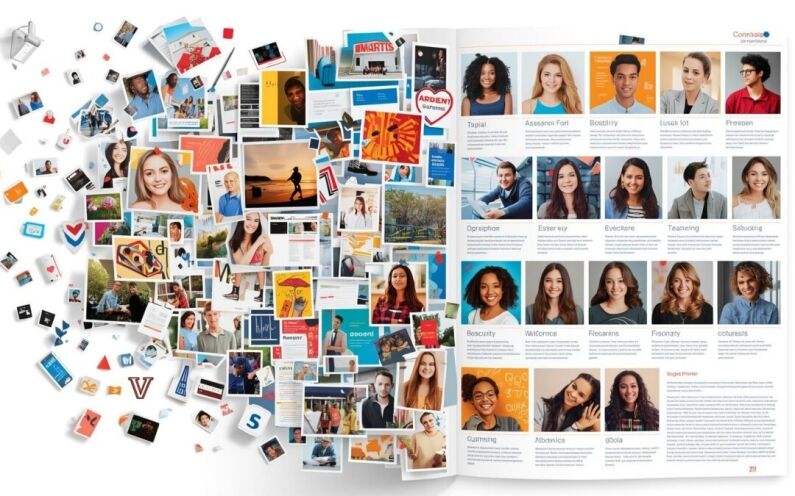
Fix #3: Improve Photo Cropping & Balance
Photos are what people remember most.
Awkward crops, too much empty space, or unbalanced layouts can distract from otherwise great images.
What to look for:
- Are important parts of the photo (like faces) too small or cut off?
- Is there unnecessary background space?
- Does one side of the spread feel heavier than the other?
Quick fix:
- Crop tighter to focus on the subject
- Keep crop styles consistent across the page
- Distribute photos and text evenly across the spread
Why it matters:
Strong visuals draw people in. Clean, balanced photo placement helps your pages feel complete and engaging.
Final Thought: Small Tweaks, Big Results
A few thoughtful tweaks can take your yearbook from “almost there” to something you’re genuinely proud to share. Tighten the details, trust your work, and don’t underestimate the impact of a final pass.
Because the difference between good and great?
It’s usually in the finishing touches.
Putting the finishing touches on your yearbook?
YearbookLife makes it easy to design, edit, and finalize with confidence.
Click HERE for a quote today
