We’ve all been there.
You open your spread and something feels… wrong.
It’s either way too crowded.
Or awkwardly empty.
Or just not giving what it’s supposed to give.
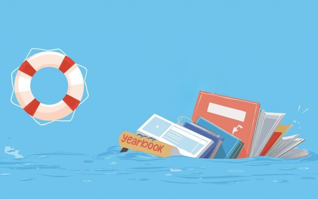
Before you scrap the whole thing — pause.
This is your design rescue guide.
Let’s save that spread. 🛟
If Your Spread Has Too Much Going On…
When everything is bold, colorful, and competing for attention — nothing stands out.
Here’s how to calm the chaos:
-
Choose one dominant photo. Make it clearly larger than the rest.
-
Limit your fonts. Stick to 1–2 font families max.
-
Remove unnecessary graphics. If it doesn’t add to the story, it’s clutter.
-
Use white space on purpose. Empty space isn’t wasted space — it gives the eye a break.
✨ Quick test: Squint at your screen. What stands out first? If the answer is “everything,” it’s time to simplify.
Sometimes saving a spread means deleting, not adding.
If Your Spread Feels Too Empty…
Now let’s talk about the opposite problem.
You’ve placed your photos… added a headline… and it still feels unfinished.
Try this:
-
Enlarge your strongest image. Bigger photos instantly create impact.
-
Add captions with personality. Don’t just label — tell the moment.
-
Incorporate a subhead or short quote. A student voice adds energy.
-
Adjust spacing. Tighten gaps so elements feel connected.
Often, a spread doesn’t need more stuff — it needs stronger storytelling.
If Everything Feels Crooked or Random…
This is usually an alignment issue.
Messy spacing can make a good spread feel unprofessional.
To fix it:
-
Line up photo edges.
-
Keep consistent spacing between elements.
-
Use invisible grid lines to guide placement.
-
Make sure text boxes align with photo edges.
Clean alignment = instant polish.
It’s one of the fastest ways to save a struggling design.
If the Spread Feels Boring…
Not every rescue is about removing chaos. Sometimes it’s about adding energy.
Try:
-
A bold headline treatment
-
A pop of your theme color
-
A dynamic crop on your dominant photo
-
A pull quote to break up space
Just remember — intentional > overwhelming.
Energy should enhance the story, not distract from it.
Ask Yourself These Rescue Questions
When a spread isn’t working, pause and ask:
-
What is the focal point?
-
Are my eyes drawn somewhere first?
-
Does every element serve a purpose?
-
Is the spacing consistent?
-
Does this match our overall yearbook theme?
If you can’t clearly answer those — that’s your clue.
🛟 Saving a Spread Doesn’t Mean Starting Over
The best designers don’t avoid messy drafts — they refine them.
Sometimes saving your spread means:
-
Removing 3 extra graphics.
-
Resizing 2 photos.
-
Adjusting spacing by a few pixels.
-
Rewriting one stronger headline.
Small tweaks can completely transform a page.
🚨 Final SOS Reminder
If your spread feels overwhelming, simplify.
If it feels empty, strengthen the story.
If it feels messy, align and refine.
Design isn’t about filling space — it’s about guiding the eye and telling the moment.
So next time you open a spread and think, “This isn’t it…”
Don’t panic.
Just answer the call.
🚨 SOS: Save Our Spread! 🚨
Your yearbook (and your future self) will thank you.
