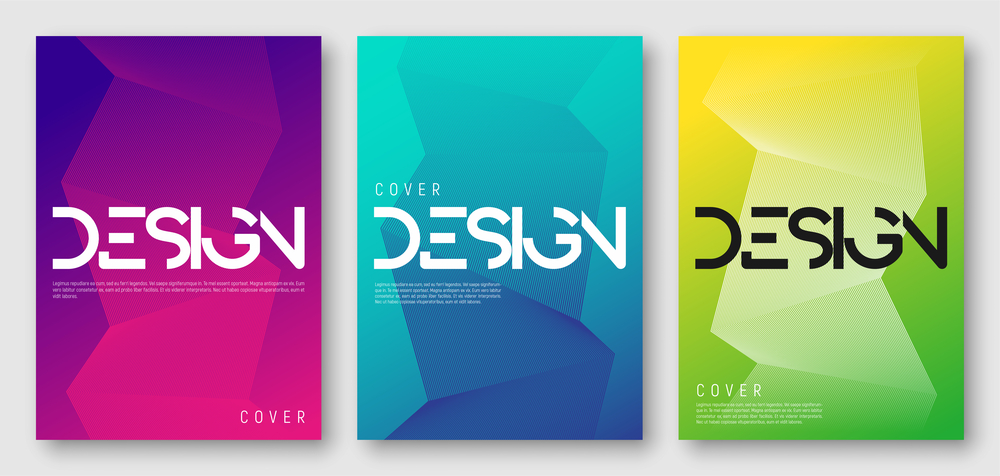
Your yearbook cover sets the tone for the look and feel of your entire yearbook. It can be overwhelming to start from a blank page and design a cover that is creative, enticing and, most importantly, memorable. Whether you are an experienced yearbook designer or this is your first time, following these tips can help you design a fantastic yearbook cover.
Keep these 3 tips in mind when designing your yearbook cover:
1.) Catch their eye!
Your yearbook cover should be unique and eye-catching. It should excite and entice the reader to check out what’s inside. It’s the gateway to what’s inside! Your design should represent your yearbook theme, if you have one, or represent your school’s colors, mascot or spirit theme for the year.
The yearbook cover is also a perfect place to invest a little bit extra in upgrades that can enhance the design and help it really stand out, such as:
- Foil enhancements
- Unique lamination styles
- Embossing & Debossing
- Different binding types
- And more
2.) Draw readers in.
The words on the cover are essential, too. They complement the design with the goal of drawing in the readers. The content should motivate students and parents to buy their copy.
Be sure to include the following copy on the front of your yearbook cover:
- The Basics – school name & year. Some schools also include their city, state & volume number. Don’t forget to include this content on the spine as well.
- Highlights – some themes that correspond with the year can be included, related to current events, sports accomplishments and/or academic achievements.
- Font Styles – Keep fonts consistent and ensure that they work with the design, rather than compete with it.
3.) Avoid common mistakes.
No yearbook cover checklist would be complete without a list of don’ts. Keep in mind these common missteps:
- Fonts – A flashy, fun font might be hard to read. Don’t sell out readability for creativity; it’s important to find the balance.
- Clutter – A little open space won’t hurt; it will only enhance. If the cover is overly busy, the focus can get lost. Be sure to let the strong messages you want viewers to see come through in the strongest way.
- Complete Cover – Your yearbook design will pop it wraps around the cover, spine and back. Don’t focus so much on the front cover that you forget about those valuable areas of real estate.
- Continuity – It’s also important that the design, elements, font and style that you choose for your cover flow into your pages as well.
Need Help? Have a Question? Contact Us Today!
At YearbookLife, we have mastered the art of making designing and creating your school’s yearbook easy. Our software provides colorful backgrounds that you can use as a starting point to enhance the design of your cover. Students love the results. The yearbook staff loves how easy our software is to use and how much support we provide. And the parents love our affordable pricing. We can guide you through the process from start to finish. Get a free quote today!

