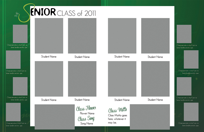
Designing the inside page layouts of your yearbook can be one of the most challenging parts of the yearbook process, but it’s also one of the most creative aspects. It does, however, take time and a certain amount of artistic skill.
With an all-volunteer staff and busy students and faculty, creating these great layouts can be challenging, but it doesn’t have to be. Here are some tips to keep in mind:
Photography: Not all photos on the page need to be the same exact size. In fact, in most circumstances, they shouldn’t be. Showcasing a variety of sizes creates a more creative look. Remember though, the most important photo on the page should be the biggest and be able to tell the biggest part of the story. The smaller photos can then support that bigger photo. For example, if a two page spread shows the prom, the focal photo maybe the crowning of the king and queen with dancing and candid photos supporting it. How about putting a border around some or all of the photos? Borders can make photos looked framed. You may want to put a thicker border around the focus picture and thinner borders around the supporting photos, or make them different colors. Use all of the photo design elements to create a striking look to the photos and the page.
Headers and Headlines: Similar to photography, not every word in the header needs to be the same size. They also don’t need to be the same font or color. There are a variety of ways to be creative with your headlines so they stand out, are recognized and most importantly remembered. What about adding drop shadows, or overlaying one color of text with another? Headlines can also be curved, placed on an angle, or placed vertically down the page.There are many design elements that can be used to manipulate the text and set up a text box. Consider ways other than a standard across the top set up.
The Margins and Bleeds: Understanding the margins will help tell you the amount of workable space you have on each page. Yearbook design software should give you guidelines as to where you can place design elements on a page, before they cross over into what is called the trim zone. While you should put background colors and elements across the whole page, so they bleed from corner to corner; you should be aware of where the trim zone is so you don’t put any significant items past it (for example, someone’s face or the last few letters of a word). This will prevent text or images from getting cut off when at the printer.
Play around with the different options your Pictavo software offers and before you know it your page will not only look great, but also unique.

