NEW tools to help ensure the HIGHEST QUALITY
High-Resolution Page View Due to screen resolution limitations that computer monitors have, sometimes high-resolution images can appear blurry in Pictavo. Now you can easily create and view a hi-res version of a page to make sure any images and other important page elements are of highest quality before submitting them for printing. Simply click on the ‘Hi-Res Preview’ button on the top toolbar while designing pages. Pictavo BuyTheYearbook users also have a ‘Hi-Res Preview’ button to ensure their images are high-quality as well.

Snap Features New “Snap To Bleed” and “Snap to Margin” functionalities have been added to ensure items that are intended to bleed off the page or stay within the margins, are placed in their proper position. By default, the Snap To Bleed function is enabled, so if you try to place an item more than half-way between the green margin line and red trim line, it will automatically snap out to the outside of the yellow bleed area. It’ll work the same way if you then try to move that item in from the edge of the bleed. The Snap to Margin is an extra precaution that prevents items from being placed outside the green margin line. It is especially helpful if you’re concerned items may be cut off the page. It is disabled by default but can easily be enabled by changing your default preferences. Just click on the ‘User Preferences’ button in the upper right-hand corner to make your desired changes.

Helpful Warnings
Upon submitting a page for approval, users will be prompted if there is any text from a pre-designed layout that has not been converted from default text (ex: “Lorem Ipsum”, “Header” or “Double click to enter text…”) to real text, thus ensuring all text boxes are either used or deleted before submitting.

Users will be notified if they have text that is too close to the red trim line and may be trimmed off.

Users will be warned if they go to Images, then Portraits and make a change that would result in someone who was previously flowed in a portrait flow to no longer be flowed. For example, if they would add a 26th person to a portrait group that was already flowed with 5 rows and 5 columns (meaning there is only space for 25 people but now the group has 26 people). A popup will now appear notifying users of any portraits that have been affected and are no longer flowed on the page.

NEW tools to help ENHANCE DESIGN
Recognition Ad Designs Dozens of new recognition ad designs have been added to Pictavo BuyTheYearbook—users are sure to find a design they like or want to use as a starting point.
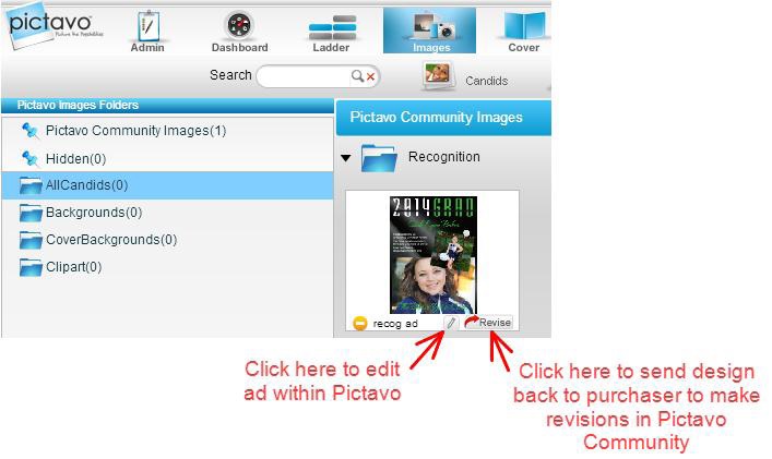
Editing Submitted Ads
If you need to make a change to an ad already created and submitted by a community member via Pictavo BuyTheYearbook, you can either make the change within Pictavo or send the ad design back to the original creator to make the revisions in Pictavo BuyTheYearbook. Simply go to ‘Images,’ then ‘Community’ and click on either of the buttons indicated below.
ENHANCED DESIGN & PAGE LAYOUT TOOLS
• Select from dozens of new fonts
• Choose among a wide range of special characters
• Create text boxes with multiple columns
• Group elements together to easily move them as a unit
• Easily align and distribute elements for consistent, uniform spacing
• Quickly and easily zoom in and out of areas on a page
STREAMLINED PROJECT MANAGEMENT TOOLS
• Assign users to pages upon account creation
• Limit font and color selections to maintain consistency and design concept throughout book
• Tag photos to identify persons while editing page
• Easily view how many times a person is tagged in photos throughout the book
• Enjoy enhanced submission warnings for elements outside of the margins and visual indicator if text is not visible
IMPROVED PORTRAIT FLOW
• Alter portrait flows after they have been flowed onto the page without re-flowing
• Choose more than one portrait flow type throughout book for greater flexibility
Advanced Page Layout Tools
Discover how advanced page layout tools, automatic portrait flow and index generation make your yearbook creation extremely simple in Pictavo™.
Convenient, browser-based software that allows authorized users access to the yearbook anywhere they have Internet!
ADVANCED PAGE LAYOUT
• Column Guides define the space needed between images and text to help your yearbook maintain a crisp, clean and consistent appearance from beginning to end
• Group elements together to easily move them as a unit
• Quickly and easily zoom in and out of areas on a page
• Work in inches or picas—whichever you prefer!
• Rotate photos, clip art and design elements in 1-degree increments
• Optional grid view and rulers view enable perfect accuracy
• Use Snap to Guides for precise placement of page elements
• Easily align and distribute elements for consistent, uniform spacing
TIMESAVING TEMPLATES
• Choose from hundreds of professionally designed templates inspired by today’s hottest trends in graphic arts
• Use as-is or as a starting point
• Available for single pages or spreads
• Placeholder text helps you envision final page layout
• Create and save your own templates
AUTOMATIC PORTRAI T FLOWS
• Quickly flow portraits and names onto pages
• Choose multiple flow types when needed (teacher, grade, homeroom, etc.)
• Alter portraits on the page without needing to re-flow
INDEXING
• Create your index in record time!
• Pictavo scans your book to find names and pre-populates your index!
• Review, revise and add before flowing index onto your pages
• Define the appearance of your index, such as number of columns, typeface style and whether you’d like alphabetical dividers between each section
• Reserve space within your index for candids or design elements that
add visual interest
Custom Cover Ideas
When you are designing your own yearbook cover the possibilities are endless. Start by outlining a plan to determine which features and options you want to include. Some schools start by reviewing pricing for various options and creating a budget to work within. Others let the design be the driving force. Either way, there are many cover options that can make your yearbook unique. The options vary in price but many are very affordable. Talk to your yearbook representative or publisher for ideas that would work well with your design and budget.
Cover Design
The front cover usually includes the year and theme of the yearbook along with custom art/designs/mascots/photos relevant to the theme. The spine usually includes the year of publication, the school or publication name and the volume number. Back covers vary greatly.
Some have minimal design while others continue the design from the front cover. When designing yours, think about the available options that can enhance your design.
Helpful Hint
You may believe that your student body will not judge your yearbook by its cover, but that is not true. Your yearbook cover creates the first impression and sets the tone for the entire yearbook.
Cover Options
There are two basic yearbook cover “styles” —soft cover and hard cover. Both include a durable coating to ensure they stand the test of time and can be ordered in the standard 8.5” x 11” size, or popular 9” x 12” size. Hard cover books, however, offer the widest variety of options from which to choose.
Board weight
Binder’s board is the most common material used to make hard covers. The heavier the board weight, the stiffer the cover will be to open. Standard cover weight is 90 pt. Heavier weights of 120 pt. and 160 pt. are also available upon request.
LEATHERETTE COVERS
Leatherette covers are made of synthetic materials that resemble leather, but are much more durable. Typically, leatherette yearbooks use foil stamping, embossing and/or debossing to accentuate the school name and cover design. Choose from this selection of
leatherette colors to make a great first impression of your yearbook! Additional colors available upon request.
FULL-COLOR PRINTED COVERS
Full-color printed covers are the most popular option— and often the most economical . When used for hard cover books, a full-color printed page is coated (for protection) and wrapped around the board.
LENTICULAR COVERS
Lenticular printing is used to produce printed images with an illusion of depth. It also gives the image the ability to change or move as it is viewed from different angles. You can create various frames of animation for a motion effect, show a set of alternate images or make an image appear 3D for a truly interactive experience!
EMBOSSING & DEBOSSING:
Embossing is a technique that uses a die to create a raised image on the hard cover. This is done through a combination of heat and pressure on the binder’s board.
Embossing can also be used in combination with foil stamping or a full-color
printed cover to create an even more unique look. Debossing uses the same
technique as embossing, except the impression is heat-pressed into the
surface of the cover so that an image is depressed (lowered) instead of raised.
As with embossing, debossing can be used with foil stamping or a full-color printed cover to create special visual effects and textures.
FOIL STAMPING
Foil stamping involves the use of heat to transfer metallic foil to a solid surface, such
as a yearbook cover. As with embossing and debossing, a die is needed to “stamp” the
foil into the cover material. Foil stamping can be combined with embossing or debossing to create a very striking 3D image. Choose from the foil colors listed to give your book a one-ofa- kind look!
SPOT UV TREATMENT
Spot UV is a great treatment to use if there are specific areas (or spots) on your yearbook cover that you would like to highlight. The application can deepen the color of an area for a very shiny finish, or flattened to a matte finish. It’s a great way to add eye-catching
emphasis to important areas.
DIE-CUTTING
A die is a specialized tool that can cuts shapes into a yearbook cover. Die-cutting allows you to cut out specific areas or shapes on your cover to allow text or part of an image to show through from the inside.
Stock Die-Cutting Options
The dies below are already created and available for embossing, debossing and/or foil on your yearbook cover. By choosing one or more dies, you can create a one-of-a-kind look without the expense that often accompanies it. For example, choose a stock die for embossing, then add a custom die of your school name and mascot to make your
book truly unique.
Endsheets
Endsheets are thick paper glued to both the inside front and back covers of a hard cover yearbook and include the flyleaf (first and last sheets in a book before and after your yearbook content). The weight of the paper is usually higher than what is used in the rest of the yearbook. Sometimes this thicker paper is left blank for autographs from the student body.
For additional fees, printing can be done on the endsheet and flyleaf sheets of your yearbook. Some schools design their endsheets to continue the theme or add a table of contents. Remember that you have two endsheets and two flyleafs that make up your yearbook—the front endsheet and front two-sided flyleaf and the back endsheet and back two-sided flyleaf. Some schools like to design the front endsheet and flyleaf, but may choose to leave the back sheets blank. Other schools have chosen to repeat the same design from the front onto the back.
Colophon
Some schools include a colophon on the endsheet or in the advertisement section that describes the specifications of the yearbook for the reader. The colophon includes info such as cover specs, endsheet specs, pages, copies, sale price of yearbook, amount
of ad revenue, staff listing, yearbook publisher, photographers, technology, and more.
Pre-designed pages
Pre-designed pages for autographs can be added to your yearbook to save time and give your book a more personalized feel. These pages are pre-printed on uncoated paper to allow nearly any writing instrument to easily write on them, then bound in your yearbook along with the rest of the pages. Positioning of pre-designed autograph pages may be
dependent on the type of binding your yearbook will have. Saddle-stapled books
have these pages either in the very middle or the outermost sheets of the yearbook. Other
binding styles allow them to be added anywhere. When designing your yearbook to
include pre-designed autograph pages, consider what other insert or divider pages you
have to determine the best placement.
Year in Review—or “current event” pages are now available as backgrounds instead of pre-printed supplements added to the back of your yearbook. As with other pre-designed backgrounds, you just drag and drop these pages onto any page in your book wherever you like; put them all together or use them as divider or intro pages between sections.
Planning Tip
When planning your cover or endsheet design, nothing is more helpful than samples of other books. Consider developing an exchange program with other schools in your area to trade samples of previous years for educational purposes. The more samples you have, the more resources you can review when making decisions about this year’s yearbook.
Templates
Thousands of schools enjoy using Pictavo—intuitive software designed to help yearbook staffs communicate, collaborate, create and sell their yearbooks. Visit www.Pictavo.com for more details about using the design software.
Pictavo offers hundreds of professionally designed templates that you can choose to use as-is or as a starting point when creating your yearbook. It also offers an extensive art library with coordinating theme ideas you can easily use to carry the theme throughout your book. Flip through the Pictavo Art Gallery or browse online in your Pictavo account to get ideas on possible themes.
Coordinated Designs
In a time crunch? Working with a small team? Pictavo can do most of the work for you! Choose from a variety of professionally designed theme combinations that include matching covers, templates, clip art, backgrounds, endsheets and more! Simply select
the elements you want for your book, drag and drop them onto your pages, and tweak as you see fit. You’ll have a professional-looking yearbook created in no time!
Backgrounds & Clip Art
The Pictavo library includes hundreds of professionally designed backgrounds and clip art in a variety of colors and designs. Flip through the Pictavo Art Gallery, or browse online in your Pictavo account to see all the possibilities! “Year in Review” or current event pages make great divider pages and can be placed as backgrounds anywhere in your book.
Custom Cover Backgrounds
Pictavo also has a library of professionally designed backgrounds that you can turn into a
custom cover for your yearbook. Just use the background as your base and add your own candids, clip art, text and more to create a custom cover for your school. Flip through the Pictavo Art Gallery, or browse online in your Pictavo account to view all the custom cover
background options.
Basics
Designing your yearbook is often the most fun part of the creation process. When working on your design, remember these principles to ensure a great looking-book that is fun for everyone page through.
Alignment
Aligning elements visually connects them to one another to create a sharper, more ordered design. It tightens the layout and eliminates the haphazard, messy effect, which can happen when items are placed randomly. Aligning elements that are not in close proximity with one another helps provide an invisible connection between them.
Repetition
Repetition ties together individual elements to strengthen a design. It helps create association and consistency by using elements such as color, textures, shapes, fonts and art.
Contrast
Contrast emphasizes or highlights key elements within your design using two elements that are total opposites. This can be achieved a variety of ways including color, fonts (classic/contemporary), lines (thick/thin) and shapes (big/small). Contrast plays a critical role in the organization of information on a page. It guides the viewer to the most important element – where he or she should look first. For contrast to work successfully, make this design element strong and obvious. It should make an impact.
HELPFUL TIP:
Make sure photos you want to include are a high enough resolution to print clearly. It is recommended that photos be 300 dpi or higher to ensure clarity.
Proximity
Grouping similar elements together or in close proximity, creates an organized relationship between those components. You also provide a focal point to give
the reader an idea of where their eyes should start and finish. Elements don’t
necessarily have to always be placed together, however. But they should be
visually connected in some way, whether it be font, color, point size, etc.
Balance
Balance is the weight distribution of a design through the placement of elements. It provides stability and structure to a design. Balance can be achieved in two ways: Symmetrical or Asymmetrical.
Symmetrical balance is achieved when the weight of elements on both halves of the
design is even, given a center line. Slice the design in half and you’ll see the same
elements in equal weight on both sides.
Asymmetrical balance is achieved when odd or a mismatched number of different elements are evenly distributed without a center line and don’t mirror. Asymmetrical layouts are often dynamic as they can create tension, express movement, or
convey a mood.
The key to developing a theme is making sure your motif addresses it in every section of your yearbook—from the front cover to the back cover. Consider creating titles that play off words of the theme, or work on conceptual themes that play off an idea or image. Maintain the same graphical elements, colors and fonts for your motif to keep the theme uniform and consistent.
Cover: Introduces the theme
Endsheets: Promotes unifying idea through color and/or
headlines, copy, photos, art, captions or graphics
Title Page: Reflects theme idea through content and design
Fonts
Fonts are a powerful design element that can add or detract from the overall look of your yearbook. They can express an emotion or evoke a feeling, similar to the way color can. Pictavo offers a huge variety of more than 200+ fonts, to choose from. To keep a consistent look throughout your book, select a “family” of 3-5 fonts to use. You can then vary the size, weight (bold/light line), leading, kerning, etc. of the font to create interest without detracting from your design.
Helpful Tip:
Most publishers provide schools fonts due to ownership legalities and to prevent mistakes in production. Pictavo offers more than 200+ of the latest fonts, with new fonts added every year to ensure a variety to suit your school.
Types of fonts
Serif: Semi-structural details on the ends of some of the strokes that make up letters and symbols. These small lines that decorate the main strokes of a letter are widely used in
traditional printed material such as books and newspapers. Studies have shown that serif fonts are often easier to read than sans-serif fonts at smaller font sizes.
Sans Serif: Doesn’t contain any serifs at the ends of strokes. The term comes from
the French word sans, meaning “without”. Sans serif fonts have become the de facto standard for body text on-screen. Although they typically appear less formal than serif fonts, they can be used for striking effect in headlines, chapter names, and advertisements. In addition, sans serif fonts are typically used when large print is called for, where serifs become a distraction.
Handwritten: Based on the fluid strokes of natural handwriting. Handwritten
fonts are a great way to add a personal touch to a design or layout.
Decorative: More artistic and eye-catching. Decorative fonts can be a useful design
tool when trying to add a certain ‘look’ or ‘feel’ to a design project or layout. These fonts should be used in moderation and only in headers or subheads for decorative or ornamental purposes, not as body text. They tend to have a very distinct look and feel and using them for body copy will make text difficult to read or make the layout look cluttered and messy.