
While photos and graphics are extremely important elements within a class yearbook, typography is also up there. That is because your typeface compliments the overall tone of your yearbook.
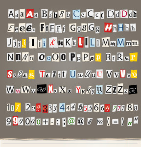 Most typefaces or fonts are part of a larger font family meaning there are various versions of the font available as well as versions of it in bold and italic.
Once determined, your typography should be applied consistently throughout each section of the book and should not be adjusted or changed just to make the copy fit. Instead, your copy editing team should become involved in adjusting the copy.
Unlike with an invitation or other professional looking piece, a yearbook should utilize fonts that are simple. There also shouldn’t be too many utilized.
It is recommended to use one serif font throughout the entire copy of the book. This type of font involves small “feet” extensions at the base of the letters. In contrast, san-serif fonts do not have feet. Two popular serif choices that should be considered are Times and Garamond. They are easy to read and are very “clean” in nature.
There are also script fonts that look similar to script handwriting as well as decorative bubbly specialty fonts. It is highly recommended to use these fonts sparingly as you don’t want your yearbook to look like a cartoon, comic book.
Help Tip: Fonts are measured in points, from the top of the letter to the bottom. To visualize one inch is equal to 72 points.
When choosing the right font for your books always consider size and readability. You may want to utilize the three-font concept that involves a serif font as a headline, san-serif as a subhead and a specialty font as an accent font. Remember though, no matter what you choose though, body and caption fonts should always be from the same family.
Yearbook software such as Pictavo can help you in choosing the right fonts for your yearbook. Don’t get frustrated though, just do some testing and then determine which style your graduating class will enjoy the most!